Hiker green
the circle, and the light wordmark beside it
#4D9B45Visual Design · Brand Design
A brand that gets kids around Dehradun outdoors — kit, maps, merch, and food.
Dehra Hiker is a startup that hands children around the Dehradun region a hiking kit — a fun-fact book, maps, merchandise and food. I designed the brand it travels under.
01 The brief
The kit is four things in a bag. The brand had to hold all four together.
Dehra Hiker gives children around the Dehradun region a hiking kit: a fun-fact book about where they are standing, maps of the trails, merchandise, and food for the walk. Four very different objects, made by four very different suppliers, that a nine-year-old has to recognise as one thing.
I was the only designer on it, for seven months, and the brief was open in the way early-stage briefs usually are: there was no mark, no palette, no rule about what any of it should look like. So I started where I could get facts, with the valley itself.
Dec 2019 – June 2020. Research, identity, packaging and the map series, in that order.
02 Research
Before I drew anything I interviewed people who know the Doon valley better than any guidebook does.
A chairman of a Dehradun firm, a professional at GMVN who runs the tours organised by the government, a chief general manager at ONGC who is on a different Doon trail every week. I asked them about the city, the trails, the temples and the stories nobody tells any more, and I mapped what came back before I let myself think about a logo.
What I heard changed more than the styling. The fact book stopped being a souvenir and became the reason for the walk.
“You are looking at a land with a lot of history, Today, no body will believe these stories”
Mr. Manu Gaur · chairman, TaxAB Associatiat, DehraDun · research interviewthe research mind map
DEHRADUN the word in the middle of the page
Everything the valley is known for, on one page, before any of it became a brand. The original sheet hung all twenty-one of these around the word in the middle with no order at all; they are gathered here under what each one is about. Nothing has been added, and nothing dropped.
03 The mark
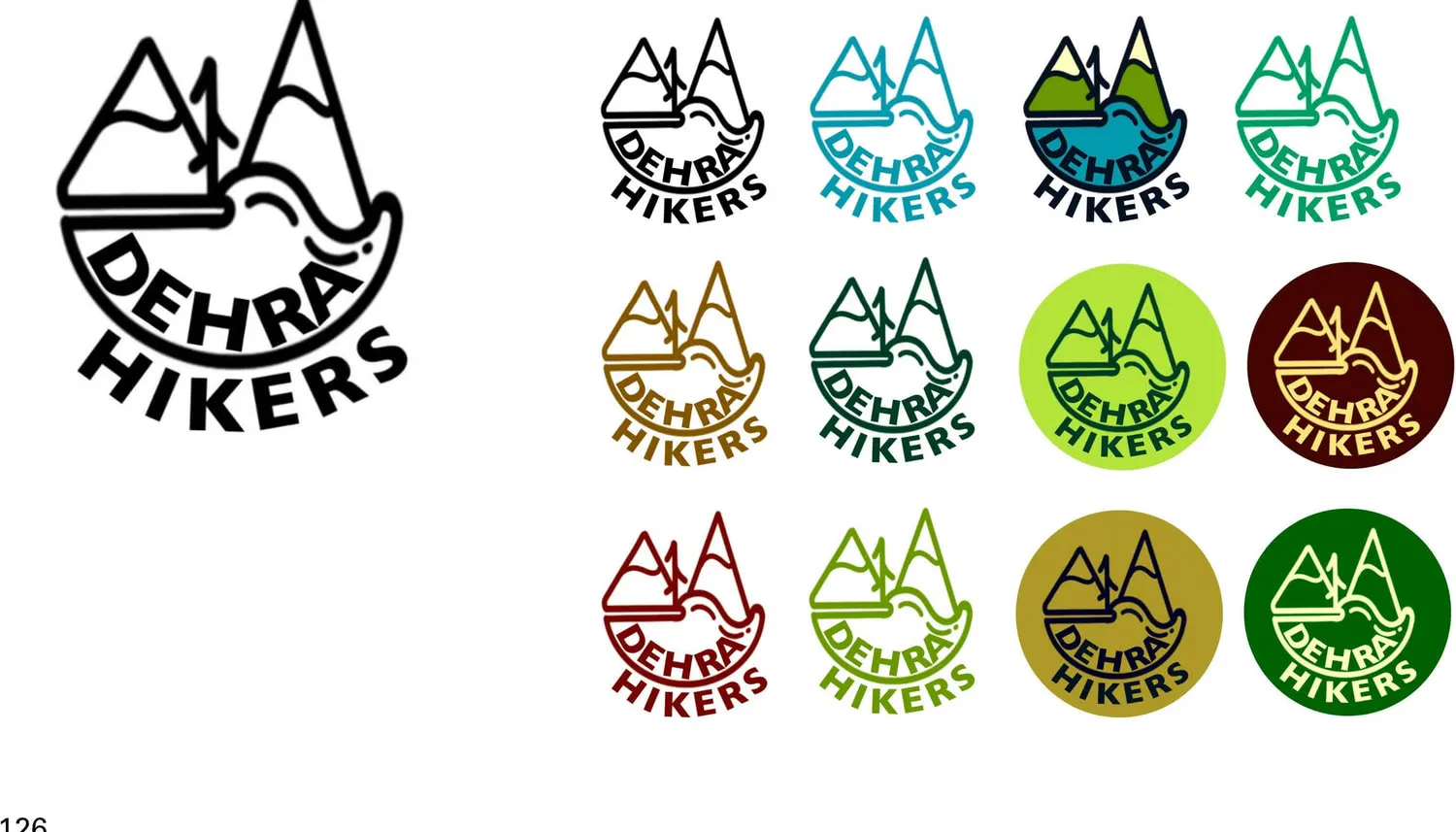
A logo a child can copy onto the back of an exercise book is a logo that works.
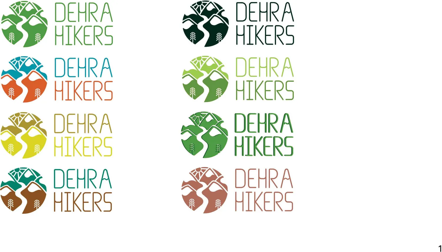
sampled from the chosen lockup
the circle, and the light wordmark beside it
#4D9B45the bold wordmark
#184D23the near-black lockup
#02261Athe light green in the two-tone version
#9CCD4Dthe ground it sits on
#5F9643The same lockup also exists in teal and rust (#0097A8 / #DB5C29), ochre and yellow (#AB9530 / #DBD424), teal and brown (#02826B / #8B5121) and terracotta (#B06C59). Eight colourways, one drawing. The rule the rest of the kit runs on is already visible here, on a single sheet.
Both marks I kept hold the same three things: the peaks, the river between them, and the trees. Everything else was negotiable.
04 The kit
One bag, packed three different ways, because three different people carry it.
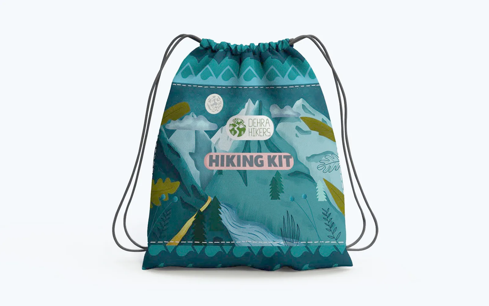
The kit was never one product. A child on a school trip, the teacher walking behind them, and an adult who just wants a day on a trail need different things in the same bag — so the contents list was written per person before a single wrapper was designed.
The original research page called them school going kids, teacher and normal people, and set the three lists side by side on one sheet.
Jacket in winter, t-shirt in summer, first aid, healthy food, a stick, a free bike, a tag and a map.
The importance of the place, a mini guide, and an award badge for the group's students.
Jacket, t-shirt, first aid, a stick, a free bike, fun facts, a map, a tag, a knife, rope and a water bottle.
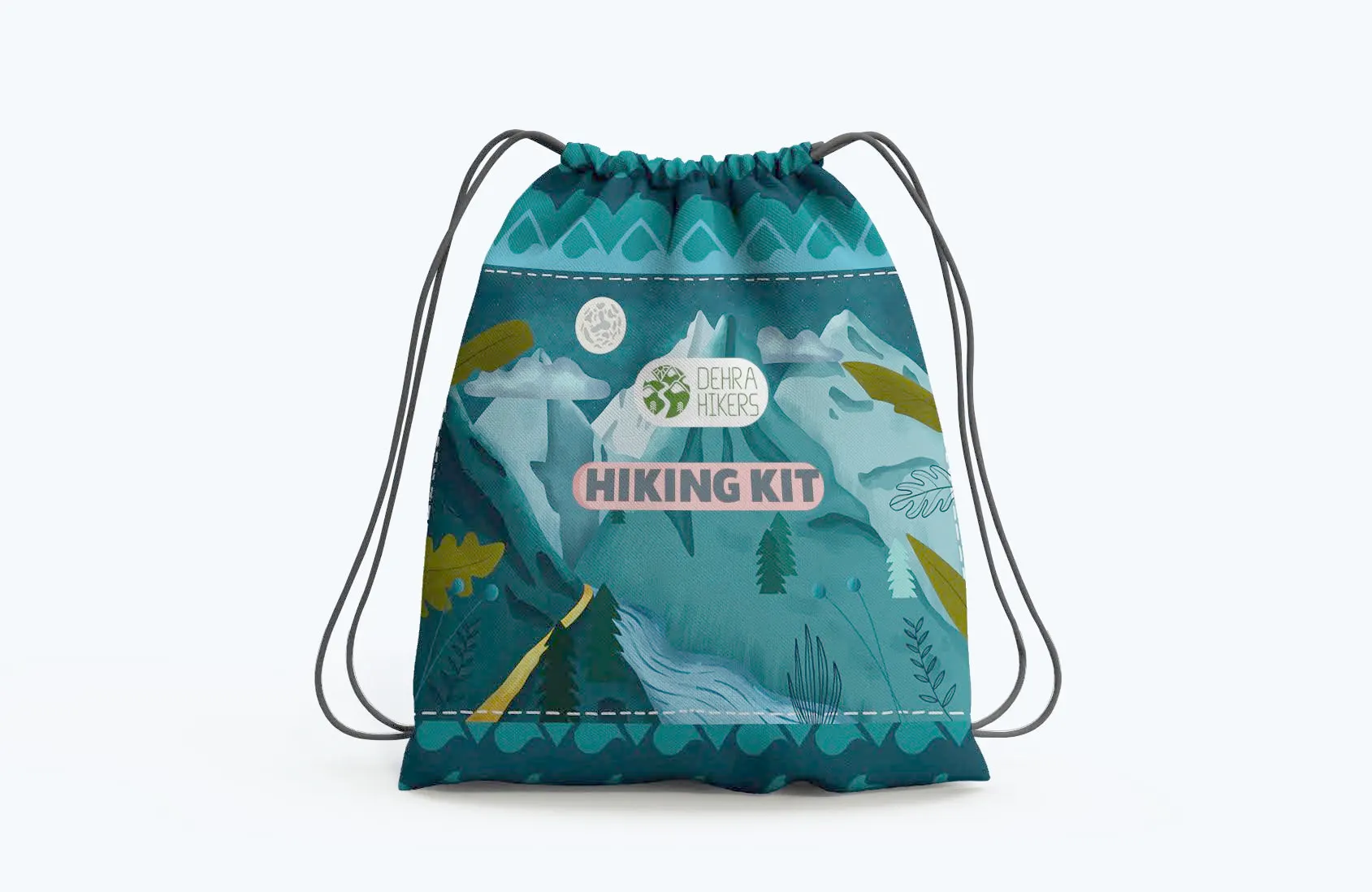
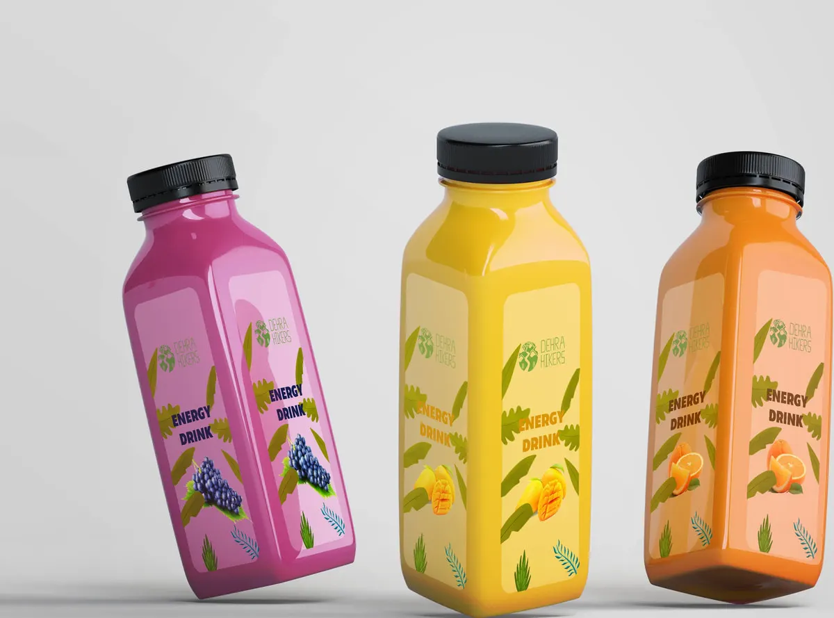
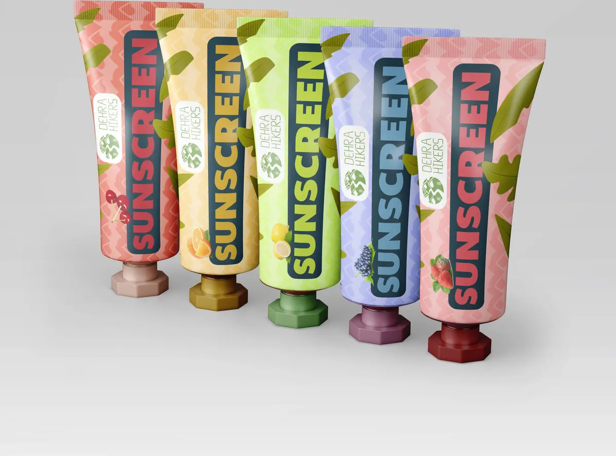
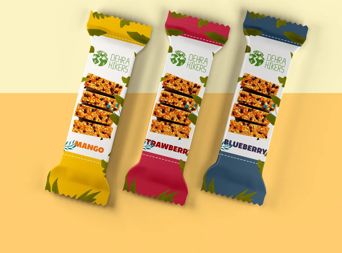
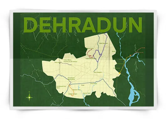
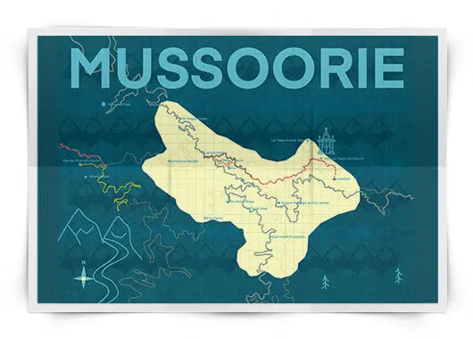
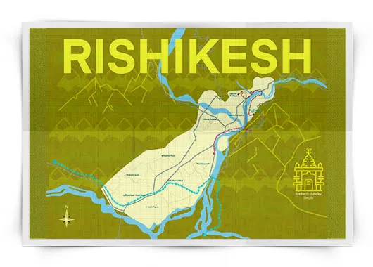
The kit had to be legible to somebody who is nine, on a hill, in the wind. An interface asks nothing harder. It is the same problem.
Branding for children turned out to be a legibility problem wearing a costume.
Everything I did after this — product interfaces, design systems, accessibility work — comes back to what the bar wrapper taught me: if the meaning is carried by colour and shape rather than by words, it survives distance, motion, bad printing and a reader who is not paying attention.
The research behind it ran long enough to become a paper of its own, on hiking, the Doon valley, and designing for children who are outdoors.
The research paper is held with the project archive; it is not published on this site.